Volunteering WA wanted organisations across the sector to measure their impact. The challenge wasn't creating the framework. It was helping people actually use it.
Let's be honest. Nobody gets excited about opening a technical toolkit.
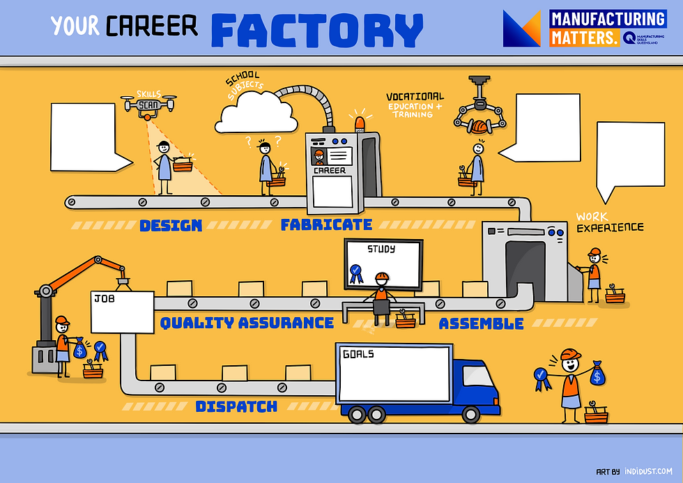
I've always believed people don't make sense of complexity through pages of instructions. They make sense of it through stories and mental models. Give someone a visual that helps them see where they are, where they're heading, and how they fit into the bigger picture, and they're much more likely to understand it, remember it, and take the next step.
That's why, instead of handing organisations a toolkit, we gave them a map.

The Impact Navigator became the map: Designed like a GPS for measuring impact, it showed two pathways depending on where an organisation was starting from. One route was created for smaller or volunteer-led organisations just getting their bearings. The other guided larger organisations that were ready to dive deeper. Instead of asking everyone to navigate the same process, organisations could choose the pathway that made sense for them.
That simple shift changed the way people engaged with the work. The framework stopped feeling like someone else's compliance exercise and became an invitation to explore. People could see themselves in the process, understand where they were heading, and feel confident taking the next step.
Melanie Liddell from Volunteering WA described the transformation better than I ever could:
"Throughout the development of the Measuring Change Toolkit, Indi Dust demonstrated a rare ability to translate complex ideas into visuals that feel intuitive, welcoming and purposeful. Abstract concepts such as program logic, outcomes and evaluation plans were brought to life through thoughtful layouts, clear visual hierarchies and engaging illustrations that guide users rather than overwhelm them. The toolkit feels less like a technical document and more like an invitation to explore and learn."
That sentence, an invitation to explore and learn, captures exactly what strategic visual storytelling is all about.

As organisations began using it, the visual language naturally expanded. Together we developed the Impact Pillars, giving shape to the values underpinning the framework. Those illustrations became an icon library. The icon library became the Foundations Toolkit. Then came the Deeper Learning Toolkit, more than fifty pages of visual guides explaining concepts like program logic, outcomes, attribution versus contribution, and evaluation planning in a way people could actually follow.

From there, the visual language continued to grow into worksheets, motion graphics, website banners, reports and online learning resources. Three project rounds later, this wasn't a single illustration anymore. It had become a complete learning ecosystem, all connected by the same visual language that started with one simple map.

When Volunteering WA first came to me, none of this existed. There was no map, no icon library, no learning pathways or resource hub. There was simply a complex challenge and a conversation about where they wanted organisations to end up.
The map came first because it had to. Once people could see the journey, every other piece had somewhere to belong.
That's what I love about strategic visual storytelling. It doesn't just make information easier to understand. It creates a shared mental model that helps people navigate complexity, make confident decisions, and move forward together.
People don't change because they have more information. They change because they can finally see the path ahead.

Check out the impact measurement resources available at Volunteering West Australia's website below.